
Visual communication
Images, infographics, and visual support for content can be the thing that helps people understand a concept, value, or workflow with ease. Where some people read to learn, others are visual.
In several writing roles, I worked with designers to develop support images and diagrams to augment documentation, represent complex configurations, and visualise brand messages.
Created in various roles
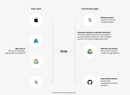
Integrations and relationships (Kinde)
Kinde is a complex platform for developers to build SaaS products on. There were a lot of connections and integrations that were possible. I commissioned this from our designer for the website.
It combines recognisable elements, such as logos. The relationships are lightly and spaciously drawn, to fit more detailed information in, without it looking crowded.
Social media posts (Kinde)

While less informational, Kinde favoured minimalist infographics to represent our brand and product concepts. Simpler is usually harder to do. These examples are about matching the images to the message.
I briefed our designer weekly so she could produce social media images for posts.
Product lifecycle flow (Seequent)
Many different products were sold under the Seequent banner, and the business needed a clear way to demonstrate the usage of each product in context with the industry lifecycle, in this case mining.
I tapped into the product manager's knowledge to sequence out the order and context, then commissioned our in-house graphic designer to develop the model. This is an example from mid-development. Apologies, I could not locate the final product.

Simple configuration map
StoreConnect is built on Salesforce, which has a complex object hierarchy model behind the scenes. Certain records have to exist before other can be created, so there are invisible dependences that customers need to know about.
Without graphic design help (I think that's obvious, lol.) I created a simple diagram to help users understand the configuration hierarchy.
